
It’s ePortfolio season at DePaul. Programs that require students to submit portfolios as graduation requirements are wrapping up, job and internship applications are being prepared as the end of the school year draws near, and everyone’s got graphic design on the brain as these eProjects are undertaken, revamped, and overhauled.
With this in mind, the UCWbL is proud to present a series of graphic design-focused blog posts packed with basic design principles, helpful tips, and illustrations. Both tutors and non-tutors should find these posts helpful. So, without further adieu, here’s your first installment: Color.
Color
Color theory is the rhetorical use of color to create contrasts, to draw cultural association or feeling, or to create context within a document.
Excessively intense or a discordant combination of colors can detract from the communication of meaning in a visual by inappropriately pulling the audience’s attention. Incorporating colors as supporting elements, not central ones, is crucial to developing rhetoric visually.
The thoughtful combination of muted and intense colors can be an effective tool for directing the audience’s attention and establishing relationships between different, potentially disparate, elements of a visual. However, excessive use of intense colors can cause confusion and be overwhelming; thus, consider using bright or intense colors judiciously to emphasize only the most central elements of a visual.
While affecting elements of a visual locally, colors collectively influence the perception of a visual as a whole. Key to creating a cohesive visual and allowing the central information to move to the forefront is harmonizing colors. A general strategy for executing this is weaving different colors throughout different sections of the visual.
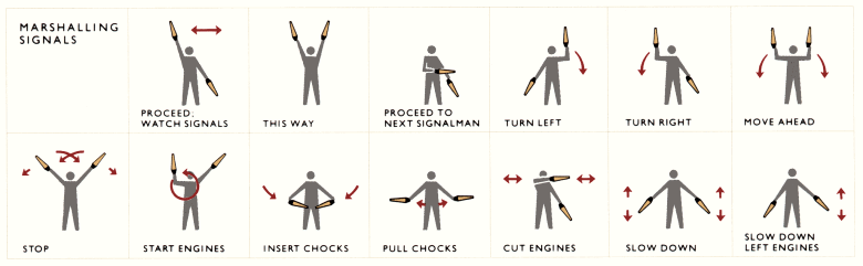
In the following visual, the intense red and yellow draw the viewer’s attention to the most central elements : the handheld lights and their movement, as denoted by the arrows. The background and boundary lines are muted, so as not to draw attention. Also, the red and yellow are woven throughout the different sections of the visual, making it cohesive. Overall, the use of color ties together the units of the visual and emphasizes the most important elements (Tufte, 1998).
Tips for Tutors:
When working with a writer on color application, consider first discussing with them the elements of their visual from most important to least important, setting a prioritizing agenda for sorting out their colors. With this agenda, you can then help them judiciously and appropriately apply colors of varying hues and vibrancies to the elements on the list based on their degree of importance. This will also help the writer understand color application in terms of drawing the audience’s attention to the most important elements, making them a more skilled designer overall.
Do you have any graphic design tips to add? Share them in the comments below!
4 replies on “Graphic Design Crash Course, Part 1: Color”
Hi Ted!
I thought this was
Hey Ted,
I thought this was a quick and informative article about the importance of color in e-portfolios. As I was reading, I thought about my most recent e-portfolio and how I used a simple color scheme: red and white (with black font). I quickly saw how it related to this article because I tried to keep my headings and other important things red. It was a simple look, and it’s probably my favorite e-portfolio yet. I look forward to future tips!
-Maggie C.
I recently discussed this topic in my ePortfolio professional development page. I think that it’s so fascinating how colors carry so much power. What do you think of when you think of red? You might think of love, Santa Clause, stop signs, Communism, blood (vitality), or red velvet cake (that’s what I’m thinking about now). The different tones of the colors affect our perception so much as well. That’s why I think this is an important post, writers should be conscientious about their color pallet.
I never realized exactly how much color played a role in graphic design. I always thought that it would be best to just choose colors that you liked together. I guess it does make sense that having a huge combination of colors can really detract from what you are trying to communicate. Thank you so much for this crash course.