

It’s ePortfolio season at DePaul. Programs that require students to submit portfolios as graduation requirements are wrapping up, job and internship applications are being prepared as the end of the school year draws near, and everyone’s got graphic design on the brain as these eProjects are undertaken, revamped, and overhauled.
With this in mind, the UCWbL is proud to present a series of graphic design-focused blog posts packed with basic design principles, helpful tips, and illustrations. Both tutors and non-tutors should find these posts helpful. So, without further adieu, here’s your second installment: Balance.
Balance
Balance: “Arranging parts to achieve a state of equilibrium between forces of influences” (Chad Engle, “The Lost Principles of Design”).
Creating a sense of balance between the different elements of a visual, much like the application of color, ensures that these elements play supporting, contributing roles in the communication of meaning, rather than detract from the message. Balance can be achieved symmetrically by mirroring the contents of a visual across the midpoint of the visual space or asymmetrically by equitably distributing elements of different perceived weight throughout a visual space.
The visual weight of an element is mostly determined by size, value, vividness, and distance from the center of a visual space. The larger, darker, more intensely colored, and farther from the center of the visual space an element is the more weight it is perceived to have; the smaller, lighter, more neutrally colored, and closer to the perceived center of the visual space an element is the less weight it is perceived to have.
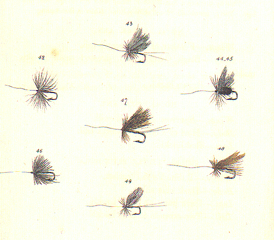
In the following visual, balance is created by distancing most hooks the same distance from the center of the visual space. The greater visual weight of the center hook, created by its wider feathers and darker coloring, helps establish a grounded center, supporting the sense of balance created by the equal proximity of the other hooks. The strategic manipulation of these factors allows variety in the hooks, while still maintaining an overall sense of balance. Each hook contributes to and supports the overall image, rather than excessively pulls the audience’s focus.
Tips for Tutors:
When discussing or addressing issues of balance in a tutoring appointment, consider using this image to illustrate how varying different aspects (size, color, location) of the involved visual elements can create a sense of balance, allowing the writer to incorporate their desired or necessary elements without compromising the effectiveness of their overall visual.
Do you have any graphic design tips to add? Share them in the comments below!