Have you ever found yourself looking at a friend’s/professor’s/classmate’s/stranger’s Digication ePorfolio, wondering how on earth they could possibly make theirs look like that? If so, then this blog post is for you. With this handy guide, you will (hopefully) walk away with a basic understanding of the world of Digication and some coding knowledge.
Here are three steps that I think will help any budding portfolio creator get started:
STEP ONE: GETTING STARTED (ePORTFOLIO TITLE & TEMPLATE)
One of the first things you are asked to do when creating a new ePortfolio on Digication is to “Choose a Title,” which is a pretty daunting task if your professor just introduced you to the platform, or if you don’t have a theme in mind. If you have a title that you want to use – use it! If you don’t, “[INSERT NAME HERE]’s ePortfolio” is a good placeholder. You can always change it later. But if you have an idea for what you want your portfolio to be like, use that idea to guide you in deciding how your portfolio is going to look and feel, including your choice of a title.
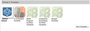
If you are just creating a new ePortfolio, you will get to choose which template you want to use. Using the DePaul Default template is the simplest option here, and is used in most DePaul classes.
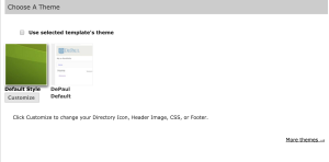
Once you’ve selected the DePaul Default template (not to be confused with the DePaul Default theme; see below), you will have another option appear below it: to Choose a Theme.
For most purposes, the Default Style theme will be a lot easier to work with than the DePaul Default theme, mainly because the DePaul Default theme limits the options that you have in terms of customization later on.
Once you’ve selected Default Style, you can click the Customize button below it, which will cause another menu to drop down. This leads you into the world of ePortfolio customization, which begins with step two.
STEP TWO: CHOOSING YOUR BACKGROUND
This new drop down menu has a lot of options, which can be overwhelming if you’re new to Digication, or if you’ve never customized a blog or ePortfolio before. So, I’m going to break the options here down into two sections: Background and CSS.
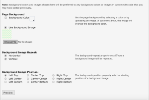
Your background is going to say a lot about your Digication page. It is a simple way to find a foundation for the rest of your ePortfolio, including a color scheme or “vibe” for your portfolio.
You’re going to have a few choices here.
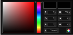
You have the option to select a background color, which brings up this menu:
Choosing this option, you have every color imaginable at your disposal. Just keep in mind that there are a lot of customizable color options that you can use later on, should you so chose to (e.g. font, headers, menus, etc.), so it’s a good idea to keep track of your background color and use it to inspire or coordinate with those color choices later (or at least prevent the colors from clashing or making your portfolio unreadable).
You can also chose to have a background image, which allows you to choose a file to upload to the site and use as the backdrop for your ePortfolio. If you want to use an image, I recommend finding one that repeats seamlessly (i.e. one that has a pattern that lines up with itself when placed side-by-side without looking like the pattern has been repeated in squares or tiles). This will make your background appear seamless and high-quality. You can choose to stretch the image to fill the entire background of your portfolio without repeating if you want, but the problem with this is that it will create white space on a larger computer monitor, and can also cause image distortion and a grainy/pixellated appearance.
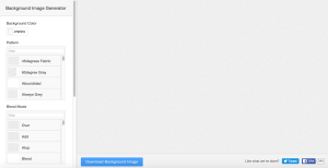
There is a great website that you can use to create your own repeating backgrounds called Background Image Generator, which I highly recommend using if you want to create a custom background image or pattern.
On Background Image Generator, you can select the color, pattern, and filter for your custom background, and it’s extremely quick and easy to use. You can always find other pre-made repeating backgrounds to use on your portfolio as well — just make sure that they aren’t copyrighted if you find them online!
Once you have your background, it’s a lot easier to figure out what direction you want to take your ePortfolio. You can find images and ideas that reflect and mesh with the background image or color you’ve chosen, and make color and design choices that achieve the feel and look you want based on your background. This leads into the other half of ePortfolio customization, which is step three.
STEP THREE: CSS
CSS or “Cascading Style Sheets” (which no one calls it) is the official Digication ePortfolio coding language. Whether or not you want to fiddle with it is completely up to you. Most classes do not require you to make these changes, but they can generate some pretty awesome and unique features if you do choose to dig into CSS. If you want to learn some basics about CSS and add some more personality to your portfolio, read on.
Customizing your CSS gives you a lot of options. A LOT. But, customizing your CSS can be as simple or as complex as you want it to be. It’s all up to how much you want to change from the default options, so don’t be intimidated. You can start small with one or two changes and work your way up to more complex editing as you learn more. But, I’m just going to cover a few basics here to get you started.
Firstly, CSS is very particular about how you enter information. Just like with writing, there are specific ways that you have to phrase things in order for the reader (in this case, the website) to understand what you’re saying. You are always going to have this format when modifying CSS code:
area of ePortfolio {
aspect of area:modifier
}
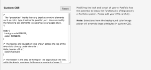
There are a lot of different areas and aspects of your portfolio that you can modify with CSS, so the words in the code will be different for each one. Here’s one example of a few lines of CSS code modifying the body of a portfolio:
The image below shows all the different parts or sections of your ePortfolio, and that the body is just one of them. As you can see below, the body is the part of the ePortfolio that is entirely black. In the code listed above, it says, “background:#EEEEEE.” That “#EEEEEE” is a hex color code, and the rainbow image below is using a lot of different hex color codes in CSS to achieve the different colored boxes. Every color has its own unique code. For example, the hex code for the black body in the image below would be 000000.
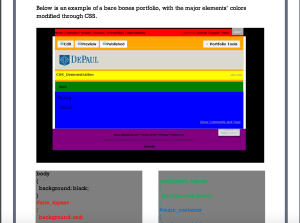
As you work on customizing your ePortfolio, you’ll need to become comfortable with finding and using hex color codes so that you can achieve all the shades you want. Adobe Color CC is a great resource when it comes to identifying hex codes and colors. I highly recommend using it to find and choose your colors and color schemes for the different parts of your ePortfolio.
If want to do EVEN MORE with your ePortfolio, there are two nifty guides that I recommend checking out if you are just getting started.
Customize Your CSS in Digication: This is a great beginners guide to CSS coding, created by the UCWbL. It tells you about the different sections of the code itself and how to change everything on your ePortfolio. It shows what parts of the code physically change what you see on Digication.
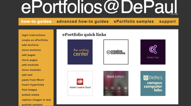
ePortfolios @ DePaul: This is an ePortfolio about making ePortfolios – crazy right? This whole site spells out everything that you would ever need to know about Digication. Personally, I’ve found the Style With CSS page to be the most useful. It provides links to detailed guides and helpful videos spelling out exactly how to do whatever it is that your coding heart desires.
Hopefully this helps you get started on your Digication Customization. Good luck with your ePortfolios!
Discover more from UCWbLing
Subscribe to get the latest posts sent to your email.


One reply on “Digication 101: Choosing Your Theme & Basic CSS”
Well done, Sarah! As a timid Digication user, I found your friendly and low-key instruction helped demystify the process of enhancing my ePortfolios. You’ve encouraged me to dig deeper into CSS. You should do this for a living!