It’s ePortfolio season at DePaul. Programs that require students to submit portfolios as graduation requirements are wrapping up, job and internship applications are being prepared as the end of the school year draws near, and everyone’s got graphic design on the brain as these eProjects are undertaken, revamped, and overhauled.
With this in mind, the UCWbL is proud to present a series of graphic design-focused blog posts packed with basic design principles, helpful tips, and illustrations. Both tutors and non-tutors should find these posts helpful. So, without further adieu, here’s your third installment: Movement & Directional Force.
Movement and Directional Force
“Both implied and actual, they help guide the eye and mind movement of the viewer. They can also bind the work into a single entity” (Chad Engle, “The Lost Principles of Design”).
Having a clear sense of movement and orientation for the direction of visual elements can help viewers navigate an image and construct meaning in a specific sequence; however, ambiguous direction can disorient the audience, causing confusion and interfering with understanding. In incorporating movement and directional force, try to clearly communicate to the audience how they should navigate the visual, potentially by using cues such as arrows. (Tufte, 2006)
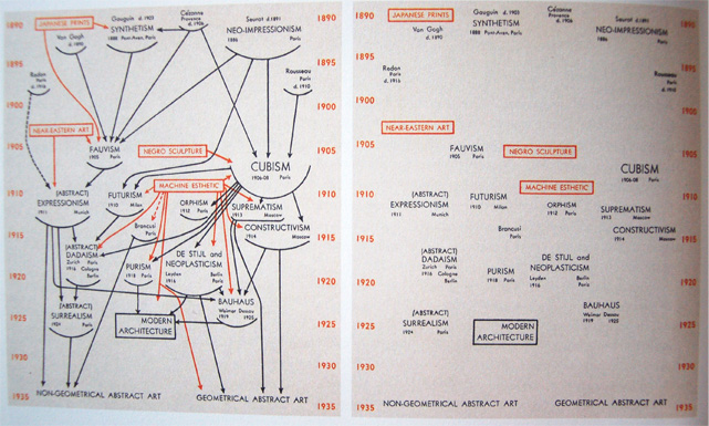
Consider the two charts below. Although they both present extreme examples of including and omitting directional cues, recognize that the lack of cues in the righthand image potentially leaves the audience unsure of the order in which they are expected to move through the different sections of text. The audience, in attempting to navigate the visual, could move through the text in an unforeseen order, interpret the visual incorrectly, and undermine the overall intended meaning.
The lefthand visual illustrates beginning at the top of the graph and following the arrows down through the different sections of text. This strong indication of direction and movement helps ensure that the audience follows a strategically organized path and constructs meaning in a particular sequence.
Tips for Tutors:
When working with a writer on a visual that involves movement or directional force, consider applying something similar to a general reader strategy. By approaching a work without expectations for the experience, you make yourself available to be guided by the directional force, either intentionally or unintentionally, created in the work. From this, you can offer specific feedback about how they might revise their visual elements to create a more effective sense of movement in their work.
Do you have any graphic design tips to add? Share them in the comments below!
Discover more from UCWbLing
Subscribe to get the latest posts sent to your email.


