It’s ePortfolio season at DePaul. Programs that require students to submit portfolios as graduation requirements are wrapping up, job and internship applications are being prepared as the end of the school year draws near, and everyone’s got graphic design on the brain as these eProjects are undertaken, revamped, and overhauled.
With this in mind, the UCWbL is proud to present a series of graphic design-focused blog posts packed with basic design principles, helpful tips, and illustrations. Both tutors and non-tutors should find these posts helpful. So, without further adieu, here’s your fourth and final installment: Consistency.
Consistency
“The recurrence of a design element coupled with a certain order to the repetition. Provides continuity, flow, direction forces, etc.” (Chad Engle, “The Lost Principles of Design”).
Developing consistency through repetition and rhythm creates layers of meaning by dividing a series of visuals into a background–what remains the same in each unit of the series–and a foreground–what changes. The audience adjusts to the presence of consistent elements, not giving them a high degree of attention, and instead allocates it to the new, changed elements. By establishing repetition and rhythm, we can guide the audience’s attention by intentionally deviating from our patterns, making distinctions between supporting and central elements in a visual, and constructing meaning.
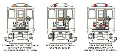
In the following illustration, the repeating train structure in each unit of the series establishes continuity and a supporting background. The changing color of the lights draws the viewer’s focus to the most important aspect of the visual, creating meaning in terms of what situation light signals denote. (Tufte, 1998)
Tips for Tutors:
When working with a writer, to create a stronger sense of consistency or address issues of inconsistency, consider asking about their intentions in applying what you perceive as incidental aspects of their visuals. By doing so, you can better understand their rationale, as to guide the appointment, or alert them to the distracting incongruities of their work that they the may not be aware of. This practice will also help the writer develop a critical eye for these kinds of sometimes-easily-missed inconsistencies in their future work.
Do you have any graphic design tips to add? Share them in the comments below!
Discover more from UCWbLing
Subscribe to get the latest posts sent to your email.


