If you’re graduating this spring, you’re probably feeling a little more optimistic about the US job market than you might have a couple of years ago. Still, whatever sort of edge you can give yourself is welcome. So let’s start by talking about that uninspiring résumé you’ve got there.

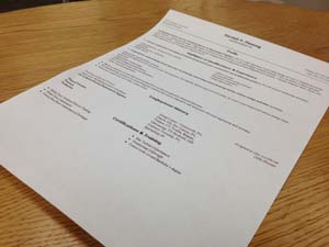
At this point, let’s not even worry about what’s on the résumé–just consider how it looks as a document. Suppose you’re a job recruiter: this wouldn’t grab your attention if it was floating around a stack of hundreds of résumés just like it. That’s because word processors have made us incredibly lazy when it comes to document design.
Thanks to programs like Microsoft Word, you can hammer out a résumé in hardly any time at all, but since these programs are so easy to use, what’s left to set yourself apart from the rest of the pack? Here are some résumé hacks to get you thinking outside the .DOC.
Use design programs like Adobe InDesign or Photoshop
 The programs in the Adobe Creative Suite can be daunting to the beginner, but making a résumé is nothing that a few YouTube tutorials and Google searches can’t clear up for you.
DePaul students have free access to these programs through the Richardson Library Mac lab, and after some initial tinkering, you can get the hang of it. If you don’t have access to InDesign or Photoshop already, you can download a free trial and use it until it lapses.
To make things even easier, there are literally hundreds of résumé templates you can use to help you get started. Check out StockInDesign and PSDCollector, although Google will be your best friend in seeking out the best résumé template for you. Again, the customizing process can be time-consuming, but hey, time and effort are what make the difference between bland and breathtaking.
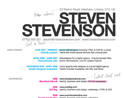
Pair typefaces together in stylish ways
 As long as you don’t use Comic Sans, you should be fine, right? True, but you can go a step further to improve your résumé’s readability by keeping these typeface tips in mind:
- Combine serif and sans serif fonts for headings and body sections
- Be consistent in the roles you assign to each font
- Differentiate the font sizes for different roles
- Use different-but-complementary colors
This guide from Smashing Magazine goes into further detail on these and other guidelines for typeface choice.
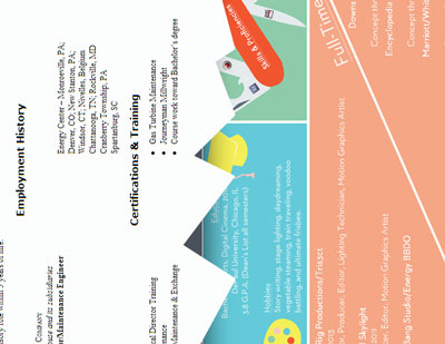
Use icons and other visuals
Think about creative ways to represent your skills and experience, like a pie chart that represents your skills distribution, or icons to replace bullet points. To start, vist the Noun Project for some inspiration.
Remember what Marshall McLuhan said
“The medium is the message” was a breakthrough for communications theory, and you should keep it in mind when designing your résumé. Nowadays it’s fairly normal to submit your application documents electronically, and for employers to view them electronically as well. So take advantage of it: add links to your Facebook and LinkedIn profiles, or e-portfolio if you have one.
But this is only scratching the surface. With an Internet connection and mobile technology, there is no limit to the ways you can turn your résumé from disappointing to dynamic and multi-dimensional. The first step is simply to get inspired. Take a look at the video below to see what I mean.
Discover more from UCWbLing
Subscribe to get the latest posts sent to your email.


2 replies on “Résumés: Think outside the .DOC”
Great advice for document design! Thanks, Mark.
I like the suggestion on using Photoshop to create the resume. Never thought of that and I can see how it can stand out from the sea of other boring resumes!