
Writing Centers in general and our Writing Center at DePaul have rightly become more focused in recent years on making sure our spaces and methods for helping writers are accessible to, ideally, anyone who wants to access our services. Among the many important accessibility considerations for us—as the Australian Human Rights Commission’s IncludeAbility initiative shows—a crucial one is considering accessibility in terms of the technology we use in our appointments and making sure we, as tutors, make reasonable adjustments for writers.
So, while it’s important to note that every individual has unique needs and there is not a “one size fits all” method to tutoring, here are some possible ways tutors can make the Online Realtime and Written Feedback appointments potentially more accessible for certain writers!
Making Online Realtime Appointments More Accessible: Changing Colors in WCOnline
During Online Realtime appointments at the Writing Center, technology plays a huge role! How can we as tutors take into consideration people’s needs? How can we utilize our time and resources to best help writers?
The Online Realtime platform can be tricky. It’s not perfect and doesn’t seem to follow universal design principles nor neurodiversity design suggestions. So, are there any ways at all we can make ORTs accessible? Let’s start with color.
Colors are subjective and not everyone has the same preference. For example, some writers may want a higher color contrast (i.e. dark blue background with white font). However, some writers might prefer a lower color contrast to reduce eyestrain. Because of the diverse needs of writers, it’s important to provide options.
The images above show that there are many ways to change colors for an ORT. You can even take away color, like the last image.
Here’s how to change color for an ORT appointment:
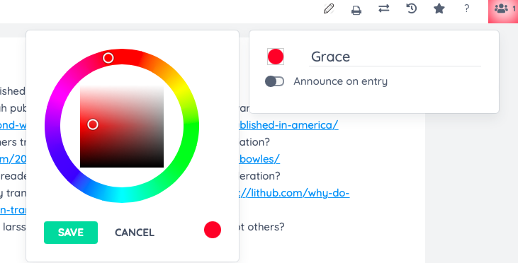
- Click on the people icon colored square in the top right corner.
- Click on the colored circle that appears next to your name.
- A color wheel will appear and you can select the color best suited to your writer’s preference.
For future appointments, remember that “providing the option to appropriately change the visual appearance (text and background colors) will improve learning retention and ease anxiety related fatigue” (NDS).
Making Written Feedback Appointments More Accessible: Fonts
Asynchronous Written Feedback appointments also heavily feature the use of technology. What are some potential ways to help writers? Since Written Feedbacks use Microsoft Word, we as tutors have more control over the font.
NDS recommends a less formal font (sans-serif) because “serif fonts tend to present an emotional response of authority, higher learning and maturity, whereas sans-serif fonts do not tend to harbor a defined emotional response, but functionally tend to be more legible and readable than their more ornate counterpart.” However, Scope, reminds us that, for some readers, serif fonts (such as Times New Roman) are beneficial; the added detail makes the letters more distinct.
Some examples of sans-serif fonts are:


Serif fonts, such as Times New Roman or Georgia, can be helpful to some readers because the letters do not mirror each other.
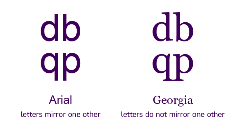
During asynchronous appointments, we can’t have a conversation about a writer’s font preference. However, typically choosing Arial, Verdana, Georgia, or Times New Roman are safer options. Being aware of these font preferences are important to know in the event that someone does express a specific need.
Making Written Feedback Appointments More Accessible: Text Layout & Typography
When composing your written feedback appointment letter, left-aligned text is usually the easiest to read (for the English language).
Adding extra white space between paragraphs creates a cleaner layout and focuses the eye on each new block of information.
According to Web Accessibility in Mind, “While there is not a universally optimal number of characters per line, in general, fewer than around 50 or more than around 120 characters per line will likely introduce difficulty.”
Making Written Feedback Appointments More Accessible: Inserting Links
It’s considered best practice to only underline text when it is to emphasize a hyperlink.
Example:
2. www.depaul.edu
Number 1 is a hyperlink that takes you to DePaul University’s homepage. But number 2 is just the abbreviated website underlined; nothing happens when you click on it. Therefore, it’s helpful and less confusing to only underline when using hyperlinks.
Conclusion
Although there is no “right way” for every single writer, there are tips and techniques that we as tutors can be familiar with so we can adjust our tutoring methods accordingly. Making our appointments more accessible benefits everyone!
During Online Realtime appointments, tutors can name their strategies and discuss accessibility practices with writers. Let writers know that they can tell their tutors what techniques and strategies they prefer. While you can’t have a back and forth conversation during Written Feedback appointments, you can still leave comments and questions for your writer that may help prompt them for future sessions.
Discover more from UCWbLing
Subscribe to get the latest posts sent to your email.
2 replies on “Accessibility Friendly Practices in the Writing Center”
So helpful!
I’ve worked with people with visually-based learning challenges. These strategies are helpful. I learned some new ones from the post. Thanks!