

During some of my recent appointments at The Writing Center, I’ve noticed many writers working on E-Portfolios are unfamiliar with the concept of visual rhetoric. Visual rhetoric is best understood as the way in which meaning is communicated through the visual. The creator intentionally conveys information through their aesthetic choices. The best way to understand this more concretely might be to look at and analyze an example of how this is done. I’ll use Kanye West’s the album to show how he establishes the tone and feel of an album before the listener hears a note.
Graduation

Take the artwork of West’s 2007 album graduation. West collaborated with Japanese contemporary artist Takashi Murakami to create a cover that was unique from anythign else the hip-hop genre had seen before. What might Kanye be trying to convey with this cover? It’s coloful. It’s artistic. It’s eclectic. If you’re unfamiliar with this album, it’s known for its maximalist production—the music is highly produced, with many layers and instrumentals. The album is fun from a thematic standpoint. Its a celebration of the triumphant success of West’s career. Kanye was making intentional aesthetic choices to give his audience a sense of what this album would be like. Visual rhetoric offers another space for a creator to communicate with their audience.
Heartbreak
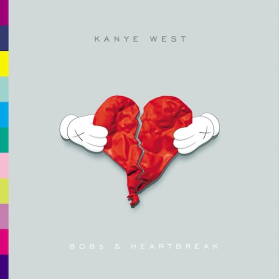
Contrast this with Kanye’s 2008 album 808’s and Heartbreak. The colors are much cooler, and there’s significantly less going on in the artwork. We see only a broken heart on a grey background. If you haven’t guessed by now, the tone and production of 808’s is very different than that of Graduation. This album chronicles hard moments in West’s life, from the death of his mother to his breakup with his longtime girlfriend. This album is sad and minimalist in its production. Looking at the cover, it’s obvious West was trying to convey a melancholy mood and a simple production philosophy to give the audience a taste of what they might expect from the music of the album.
Yeezus
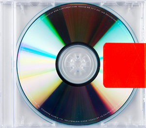
Now let’s look at Kanye’s critically acclaimed sixth album Yeezus. Pretty different from the other two, right? It’s not really a cover at all—just a red piece of tape on a CD case. This album marked a significant departure from the norm for West; it’s raw and unrefined. It’s also aggressive, which you get a sense of by the blood-red color of the square on the cover. While some might look at this and think he didn’t care what the album cover looked like, I think—in line with his other albums—Kanye was sending a very deliberate message to the audience through his choices. These aesthetic choices tell me this album is not overproduced like his earlier work. It’s straight from the rapper’s mouth to the listener’s ears, with nothing getting in the way in between.
Every choice a creator makes sends a message to the audience, whether it’s intentional or not. For that reason, visual rhetoric should never be overlooked when designing an e-portfolio, website, or other medium. Writing is, after all, more than the words on the page. Whatever medium the writing exists in, it should make use of all of the available means of persuasion in the act of communicating with the audience.
Discover more from UCWbLing
Subscribe to get the latest posts sent to your email.